TL;DR: Convert a bitmap image into an SVG with sine wave line shading. See the code here: https://github.com/0not/laser_tools/
I recently built a laser engraver/cutter with a 30 W diode laser module and an OpenBuilds ACRO positioning system. I wanted a way to engrave moderately detailed images without having to deal with the slow speed of raster engraving. I ran across a video of an Inkscape plugin that could convert an image into a series of sine waves. (I can’t find that video or plugin now, but I do remember the plugin was associated with a Russian site). The plugin could change the frequency and amplitude (and a few more things) along each sine wave in order to realize a brighter or darker area of the image. Here is my attempt at a similar technique, but with only altering the frequency. I used Python and a Jupyter notebook for this project.
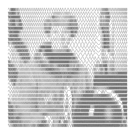
The algorithm is fairly simple: take an image then group and average adjacent rows to achieve some target output number of lines; convert the intensity at each pixel along each row into a frequency; accumulate the phase of each row/line to generate the output sine wave; and finally, display and save the waves as a vector image.
 |  |
The trickiest part about this project was properly accounting for phase as the frequency of the sine wave is changed. Here’s an example of what we don’t want:
x  = np.linspace(0, 50, 1000)
y1 = np.sin(1.1*x[0:len(x)//2])
y2 = np.sin(3.0*x[len(x)//2:])
plt.plot(x, np.hstack((y1, y2)))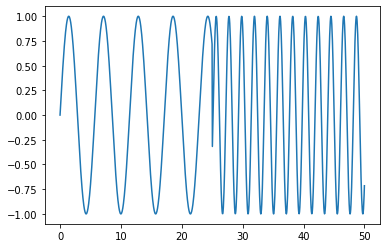
In this example, the first half of the wave is at one frequency and the second half is at another. At the halfway point, these two waves have different phases, so we get a sharp transition.
To fix this problem, we need to accumulate the phase so that at the transition it is correct. Here is an example that accomplishes this:
x   = np.linspace(0, 50, 1000)
fs  = len(x) / x[-1]
f1  = 1.1*np.ones(len(x)//2)
f2  = 3.0*np.ones(len(x)//2)
f   = np.hstack((f1, f2))
# ex: np.cumsum([1, 2, 3, 4]) = [1, 3, 6, 10]
phi = np.cumsum(f) / fs
plt.plot(x, np.sin(phi))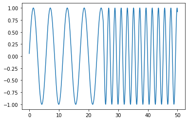
I used the cumulative summation function from numpy to accumulate the phase from the lists of the two frequencies. The phase needs to be dimensionless and to account for having more than one sample per frequency, I divide by the sample frequency.
Once each sine wave is built up, I stack them vertically with (hopefully) the correct spacing and export the plot as an SVG. Using any number of tools, the SVG can be converted into g-code. I have mostly been using LaserWeb and cam.openbuilds.com.
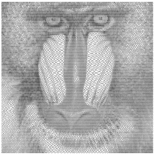
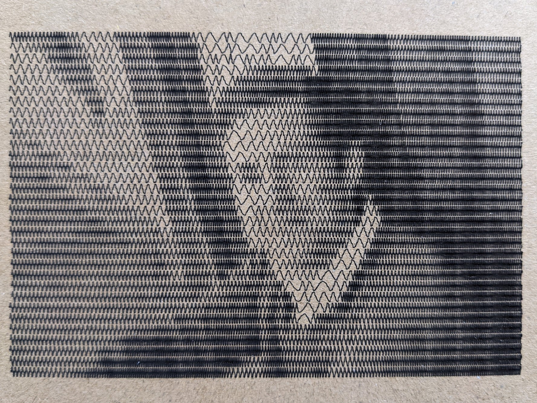
Here is the first image I actually “engraved” on cardboard. The power was a bit too high, but the image is still visible:
Give the Jupyter notebook a try using mybinder.com. The code is hosted at github.com. The code is useable, but hardly more than a proof-of-concept. Feel free to make something of it. Go wild!